
Integrative media alumna Erin Gallagher ’13 of Kingston, Pa., has been creating visual representations of social media activity since February 2017, and it is turning heads across the country. Her work has been gaining attention and has been featured on the online news site Buzzfeed. It recently earned her an interview with the Canadian Broadcasting Company.
The Canadian media giant read about Gallagher in The Intercept, an online publication, which led them to her blog on Medium, a platform for bloggers. The network traveled to Wilkes-Barre to interview her about her work in September.
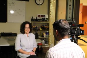
The Canadian Broadcasting Company interviews Gallagher at Wilkes University.
Gallagher describes her work as “ongoing social media research.” Gallagher started her data visualizations to help others understand social media manipulation.
“After the 2016 election there was a lot of fear about propaganda bots swaying public opinion and trolls nudging us to vote one way or another, or to not vote at all,” she explained. “So my original intention was to show people what Twitter bots look like, and I’ve done that a few times. But I’ve found that there is also value in showing people what our real human interactions on social media look like.”
Describing her process, Gallagher says she downloads tweets for a hashtag or a keyword. She then creates a network graph of that Twitter activity using Gephi, an open source network visualization software that reveals patterns and trends in the data being researched. The result is a visual representation of a digital conversation shown by burst of color on a black background, resembling fireworks at night.
“I’ve been creating data visualizations of Twitter networks since February 2017 – the first visualizations I published publicly were in April 2017,” she said. “I’ve published over 20 sets of visualizations since then with network analysis on various hashtags, search terms and individual twitter accounts.”
Gallagher researched the hashtag #MeToo and said that those visualizations have been some of her most impactful graphs. They were featured in Artnet News in November 2017. The #MeToo hashtag took off across social media when actress Alyssa Milano posted a Tweet suggesting “if all the women who have been sexually harassed or assaulted wrote ‘Me too’ as a status, we might give people a sense of the magnitude of the problem.”
Gallagher harnessed that message as an image showing how often the hashtag is used in the Twitter community. She wrote on Medium, “The network froze my computer several times just trying to make preliminary visualizations. I’ve never seen a network so dense before. I thought I made a mistake and re-checked my work several times to be sure it wasn’t an error.”
Gallagher’s work was also published multiple times on Buzzfeed, including visualizations of a Russian troll account in the Mueller indictment and one of scammer bots that promote fake giveaways on Twitter.
“In the beginning, people I showed my work to seemed mostly confused, but I think my work is starting to gain attention because people are beginning to understand what these kinds of data visualizations mean,” she said.